
Uncategorized
Choosing the Best Color for a Restaurant Interior
Mar
Your favorite color doesn’t always mean it’s the best color for a restaurant. When decorating (or redecorating) your restaurant’s interior, there are a few things you should take into consideration to ensure you choose the best wall colors.
Keep in mind the paint color you choose should add to the overall ambiance of your restaurant, be in line with your branding and marketing efforts, and create an environment that your customers want to revisit time and time again. You’ll also want to try to create cohesion between your wall color, dining room tables, and chairs.
We’re going to go over exactly how you can choose the best restaurant wall colors for every design and theme. While making recommendations for the colors you should use, we will also give advice for when you should avoid them.
Restaurant Color Schemes
Generally, warm restaurant color schemes create an appetite-stimulating environment. However, cool color schemes have their place, too.
Warm Color Schemes
A warm color scheme includes:
- Reds
- Yellows
- Oranges
- Beige
1. Reds
Red signifies energy and passion. It can increase heart rate and blood pressure, and lead to impulse ordering (typically happens when a customer first sits down and craves an appetizer, so they order right away).
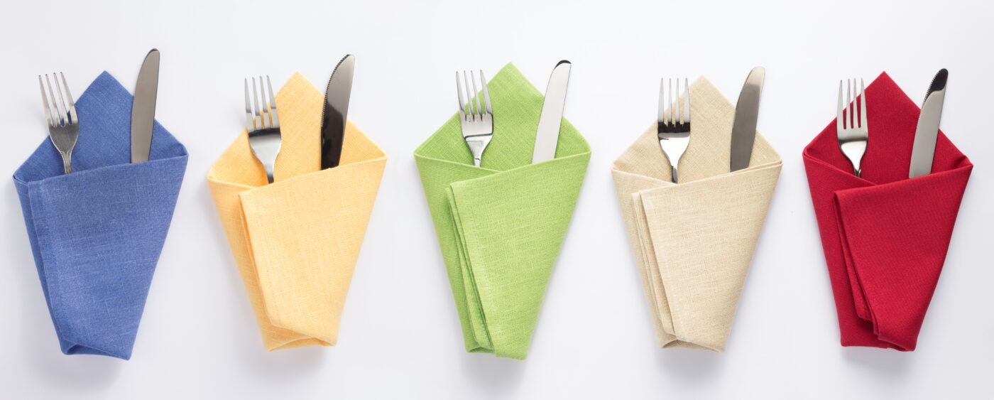
Therefore, red walls would be a great option if your restaurant offers small bites, fast food, tapas or dim sum. If you don’t want to go all in with red walls, you might want to use red tabletops, tablecloths, or napkins.
When not to use: Bright, energetic reds are not good for high-end, luxurious restaurants. If you want to create an environment where your customers like to linger, opt for deeper reds. Bright reds are better-suited in faced-paced restaurants.
2. Yellows
Yellow is a cheerful color, but it can be energetic and a bit overwhelming. Too much yellow might make patrons more likely to get angry and uncomfortable.
However, if your goal is to create a fast-paced environment that turns tables quickly, yellow might be exactly what your restaurant needs! This could be the perfect color for fast food restaurants, counter service cafes, or coffee shops.
When not to use: You don’t want to use yellow in a restaurant where you want your customers to feel “chill.” It’s best for establishments that don’t plan on serving anyone for more than 30-60 minutes.
3. Oranges
Orange is right in the middle of red and yellow. It’s great for grabbing attention and elevating mood, but it can be overwhelming in certain environments.
Orange might be the best paint color for restaurants with fun themes, cheerful cafes and coffee shops, or new-age delis. You want to try to play up the cheerfulness of the orange so it doesn’t feel overwhelming.
When not to use: Orange walls aren’t likely to be a good option for fine dining restaurants because orange can be perceived as immature or “funky.” If you think orange would go well in your fine dining restaurant, consider choosing a deeper hue like terracotta or burnt orange.
4. Beige
Beige can really be warm or cool, and you can choose a beige that goes well with the rest of your restaurant furniture. Beige is a very versatile color, which makes it a great option for restaurants that like to change their decor with the seasons.
Beige is a popular home decor shade, so painting your restaurant beige might make patrons feel at home. This might be the best choice for your establishment if you want to create a comfy-cozy environment.
When not to use: Stick to brighter colors with more personality if you don’t want your customers to linger for hours.
Cool Color Schemes
A cool color scheme includes:
- Blues
- Greens
- Grays
- Black
1. Blues
Blue symbolizes stability and safety. It’s an extremely popular color, but not for every restaurant!
Blue is likely the perfect choice for a seafood restaurant. It will remind patrons of the ocean, a clear blue sky, serenity, and tranquility.
Some restaurants might do better with blue accents. For example, Greek restaurants are often blue and white-themed (like the greek flag), in which case a blue accent wall would be perfect
When not to use: Blue is said to suppress appetites. Therefore, it should be used very carefully. The situations we described are often the best-cases for blue in restaurants.
2. Greens
Green symbolizes harmony, relaxation, and peace. It makes people think of fresh food, nature, and health. Therefore, it might be the best choice for health food restaurants, smoothie bars, or sandwich/salad cafes.
When not to use: Green should be avoided in steakhouses and in other meat-heavy restaurants. It can reflect on the mea and make it look spoiled.
3. Grays
Grays are the beige of the cool color schemes. Gray typically makes people feel calm and at ease. It’s a very versatile color, which, again, is perfect for restaurants that like to change their decor often.
When not to use: Stick to brighter colors if you don’t want your customers to linger.
4. Black
Black is timeless, bold, and sophisticated. It can look fresh and clean when balanced with white; it can create a modern look or a classic aesthetic; it can create drama and feel extremely luxurious.
If you want to create a sultry environment in a lounge, speakeasy, or swanky dinner restaurant, black might be the perfect choice for your walls.
When not to use: Black is probably not well-suited for daytime restaurants.
Your restaurant furniture and the mood you’re trying to create are the most important things to consider when choosing the color of your restaurant walls. Start there and select a few paint samples. You’ll know when you’ve found the best one!
Bistro Tables and Bases
Bistro Tables and Bases offers premium restaurant tabletops and bases, barstools and chairs, and so much more. Browse our online collections today!